Summary
ScootScoot is a concept for a semi-autonomous e-scooter, designed with a team of four for a graduate interaction design course at Carnegie Mellon. The brief was open-ended: explore new control ideas and user experiences for a vehicle that can partially drive itself. I worked across research, interface design, and physical prototyping, building the working handlebar prototype (brake, blinker, horn, mode dial) alongside the Figma dashboard it was wired to control.
Research & Insights
We ran guerrilla interviews with six current e-scooter riders (a student athlete, engineering and business students, and a professor) to understand how people actually use and feel about their scooters. Three insights shaped everything that followed.
It transports me, but I also transport it
Riders carry their scooter as much as they ride it: up stairs, onto buses, into buildings.
Everywhere, but not seen using it
People rely on their scooter for daily trips but are self-conscious about riding it in front of others.
It has to suit every need
Riders will only adopt a scooter if it holds up across weather, terrain, and errands, not just a commute.
From Sketches to a Working Prototype
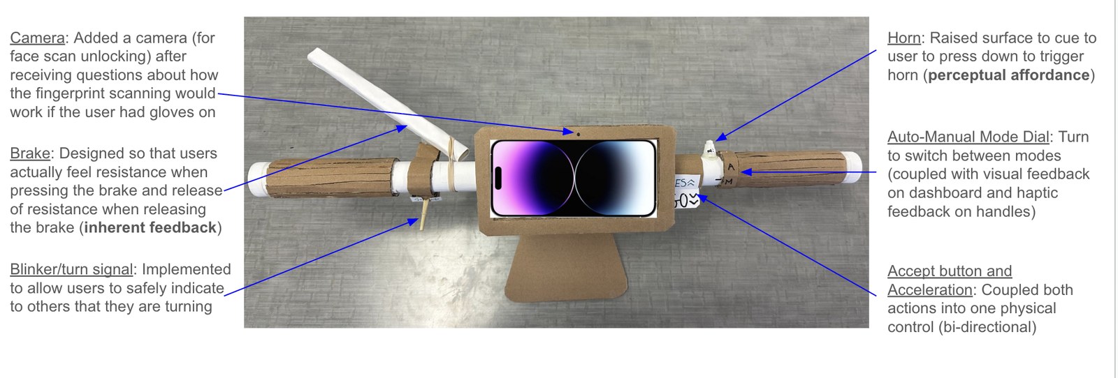
We converged on ideas from individual thumbnail sketches (a fold mode for compact storage, GPS navigation with rerouting, physical dashboard controls, road-obstruction alerts, hands-on unlocking, and an autopark mode), then built a physical handlebar out of cardboard, PVC pipe, and a phone mount, wired to a Figma prototype so it could actually be "driven." A rubber band gave the brake real resistance; a repurposed water bottle became a swiveling kickstand.
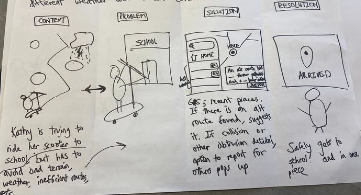 Problem-framing storyboard
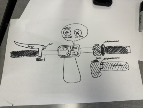 Early handlebar concept sketch
Designing the Interactions
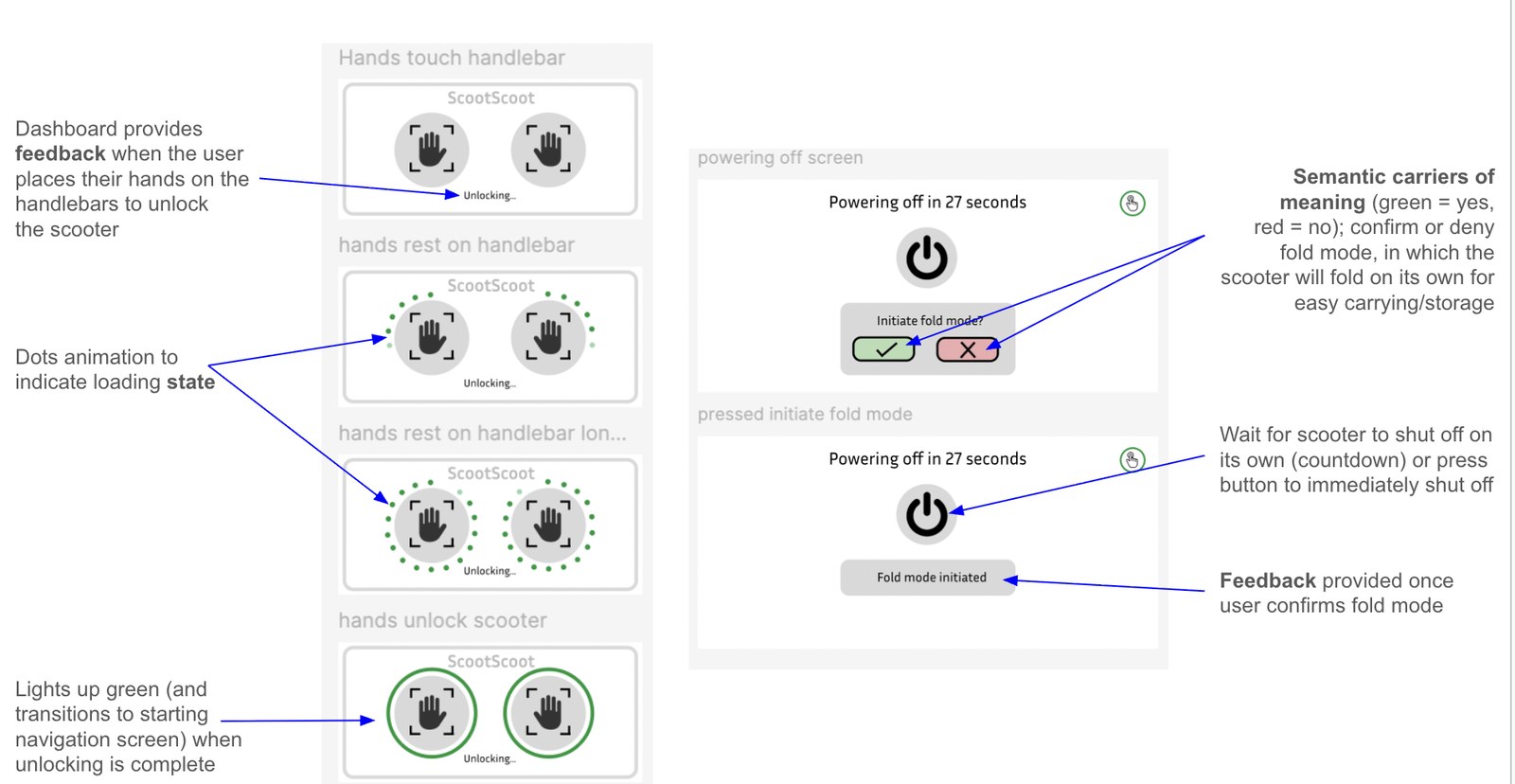
The dashboard had to communicate state at a glance: unlocking, mode changes, and moments when the rider needed to take back control. Resting a hand on each grip triggers an unlock animation; a fold-mode confirmation uses clear green/red semantic cues before the scooter folds itself down for storage.
Field Testing & Iteration
We tested the paper prototype on real riders and rebuilt based on what confused them. Every participant overlooked the autopark option at the start of a route, so we moved it to appear after arrival instead. A speedometer icon read as unclear for "accelerate," so we relabeled it "GO." And nobody found the blinker until we added simple arrow icons.
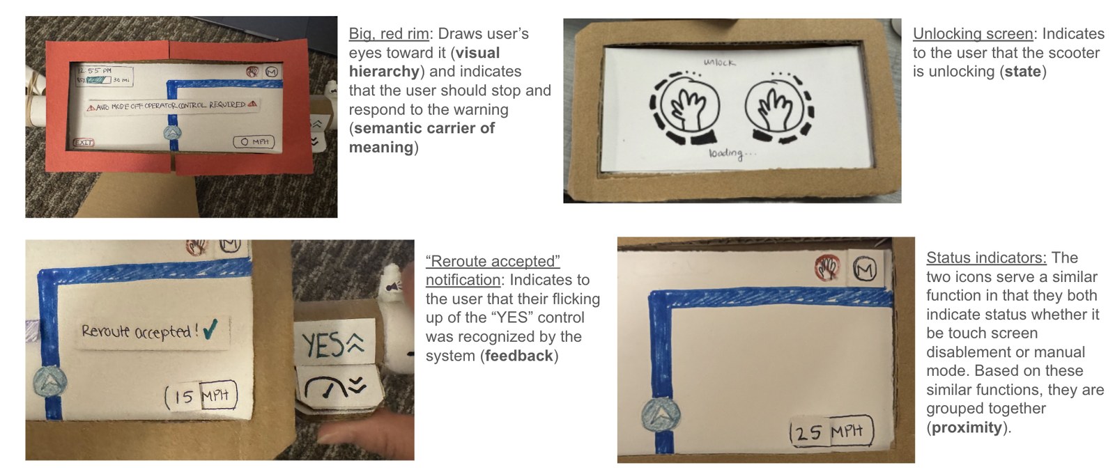 Paper prototype, before field testing
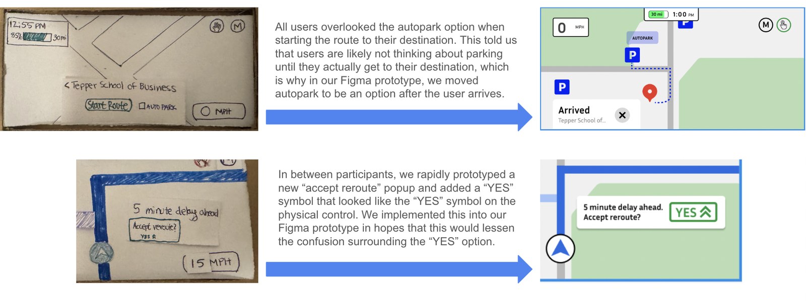 Autopark & reroute, redesigned from field feedback